


Digital Film Recipe vs. Real Analog Film - Kodak Portra 160
I tested a real film stock with a digital film recipe from FujiXWeekly, here are the results...

Today I am starting a new series here at FotogRAFia, it's called "How do film simulations compare with real film stocks?” You are reading the first edition.
Since I started experimenting with film recipes from FujiXWeekly a couple of years ago, I became curious about performing an actual test comparing this digital wizardry with analog film. That task was postponed many times, but this week I decided to roll up my sleeves and do it.
This looks like a simple task, but it's not; mostly because it relies on the expertise of accurately converting the negative in the most reliable way possible.
I obtained a Portra 160 film recipe and configured my digital Fujifilm camera accordingly. Then, I loaded a roll of Portra 160 (💕thank you paid subscribers!💕) in my Voigtländer Bessa R2A. I used lenses with similar focal lengths and tried to compose the shots similarly. My Fujifilm is medium format, which gives me a 4:3 frame, the analog is 1.5:1.
I think a good place to start is with a quick equipment list, followed by some considerations for the test, the softwares I did create to facilitate comparison, results, and conclusion.
Equipment used
Digital
For the digital realm, I used a 102 megapixel Fujifilm X100s with a Fujinon 63mm f/2.8 R WR lens, configured with the Kodak Portra 160 v2 recipe from FujiXWeekly.
Film Simulation: Classic Chrome
Grain Effect: Weak, Small
Color Chrome Effect: Weak
Color Chrome FX Blue: Weak
White Balance: Daylight, +4 Red & -5 Blue
Dynamic Range: D-Range Priority (DR-P) Auto
Color: 0
Sharpness: -1
High ISO NR: -4
Clarity: -2
ISO: Auto, up to ISO 6400
Exposure Compensation: +1/3 to +1 (typically)
Note: film recipes are different from Fujifilm's stock film simulations. The recipes are based on the film simulations, but they contain additional adjustments like changes to tone curve, sharpness,clarity, ISO recommendation, etc.; for that reason, it takes longer to save the file to the SD card, as the camera performs additional processing. Additionally, it is typical practice to save a custom camera setting with the recipe configuration in order to quickly switch from one recipe to another, or from one recipe to no recipe at all.
Analog
For the analog wonderland, I obviously used an unexpired Portra 160 roll and a Voigtländer Bessa R2A camera with a Typoch Simera 50mm f/1.4 ASPH Lens for Leica M. Things are so simple (and smaller, more on that later…) in the analog world!
Dev & Scan
After developing the film with CineStill C41 chemistry, I let the film dry for 3 hours and DSLR scanned it with the Fuji GFX using my usual scanning rig. Then I converted the images using Negative Lab Pro's "Portra" preset with no major changes to the preset.
I simply converted one photo that I knew had a wide color gamut, then used the "Match” feature in NLP3.1+, so the image processing got applied it to the other photos, following best practices also documented in another post (link below).
Negative Lab Pro color cast issue, and how to make it work properly

Disclaimer: this post gets quite technical about Negative Lab Pro, which is a software used to convert negative RAW files into positive images.
Test Considerations
Before starting, I think it's important to establish some specifics about my testing, as there are many ways to achieve this, and stating how I tested is relevant in case you want to dive deeper and engage in the comments section.
The film recipe does not specify a particular ISO to be used, which is actually the main challenge with these film recipes. This Portra 160 recipe says "ISO: Auto, up to ISO 6400," so for this test I used the same shutter speed and aperture as indicated by the analog light meter, changing the ISO on the digital camera to match the exposure, meaning the ISO varies across the digital shots.
On the digital camera, I shot JPG only to eliminate any risk of confusion with RAW files, and I also didn't reference the histogram or light metering. I simply set the +2/3 EV (as suggested by the recipe) on the Fuji ran it in Auto-ISO mode, by having the camera change the ISO while maintaining the same shutter speed and aperture as indicated by the Voigtländer's light meter.
To reduce chances of my composition changing, my shooting workflow was:
Focus with the analog camera and check exposure—don't shoot yet;
Set the same exposure parameters on the digital camera by changing ISO;
Take the shot with the digital camera and quickly swap to the film camera, which was already in focus;
doing that quickly prevented the scene from changing too much;
an average of 5 seconds between shots.
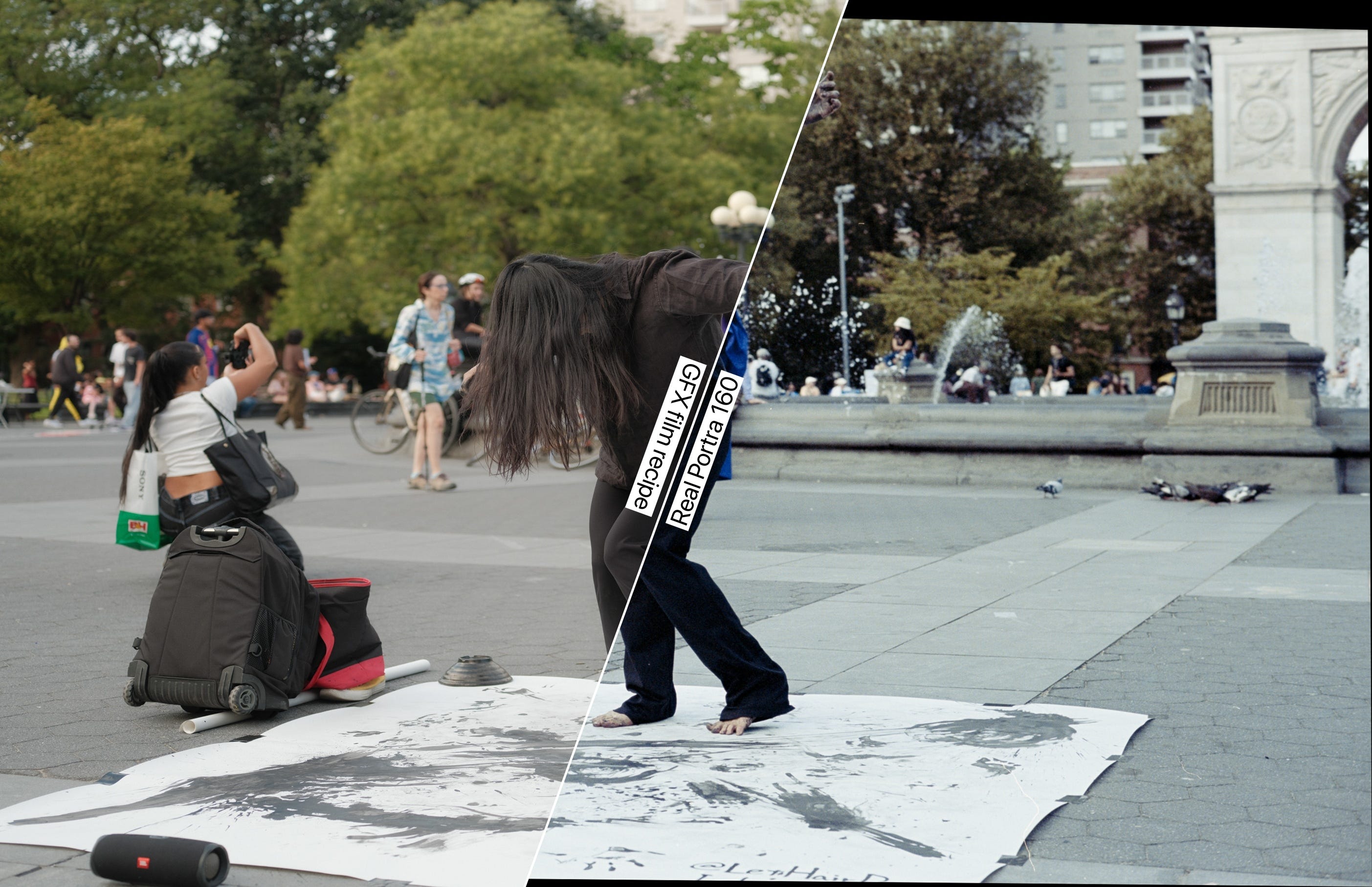
Another important thing to highlight is that these are not my best pictures, but they serve this specific test. I wanted the exact same subject on both digital and film, which limited my creativity and composition, so don't expect any of Bresson's decisive moments here. Also. I am a human ¯\_(ツ)_/¯, and although I tried my best to achieve the same composition, there are differences between same shots, which got minimized by my distortion software.
To avoid color grading bias, I didn’t look at the JPEGs from the digital camera until I had developed and scanned the film photos.
Software comparison methodology
After downloading the JPGs from the SD card and developing and scanning the film, I had JPG files for both the digital film recipe and analog shots. I then developed two pieces of software to enable a smoother comparison and generate the images you'll see in this post.
The first tool automatically aligns and crops one image to match the other, creating better side-by-side comparisons. This was necessary because the shots came from two different cameras with different lenses, cameras, and aspect ratios. When placed side-by-side without alignment, the visual inconsistencies distract from the actual comparison between digital and analog results.
This alignment process occasionally creates black borders on one image, which you may notice in some comparisons, I decided not trimming it for transparency, so we can see the amount of distortion.
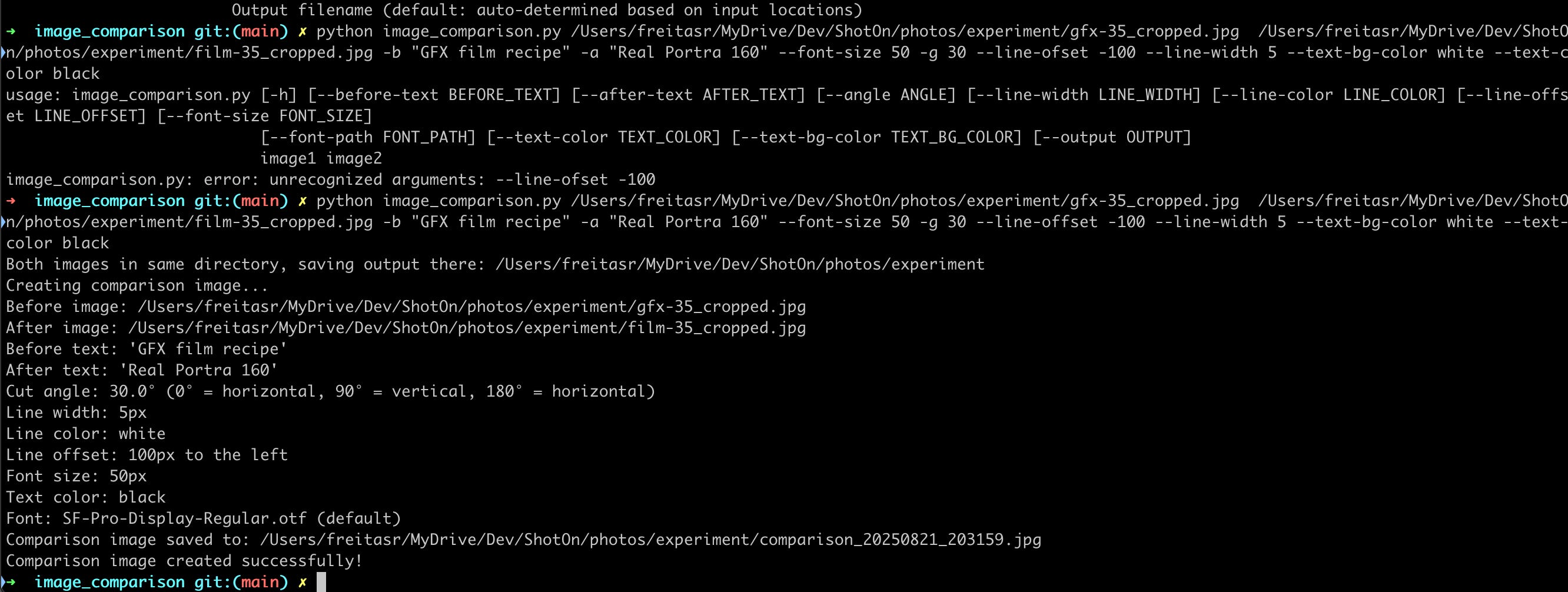
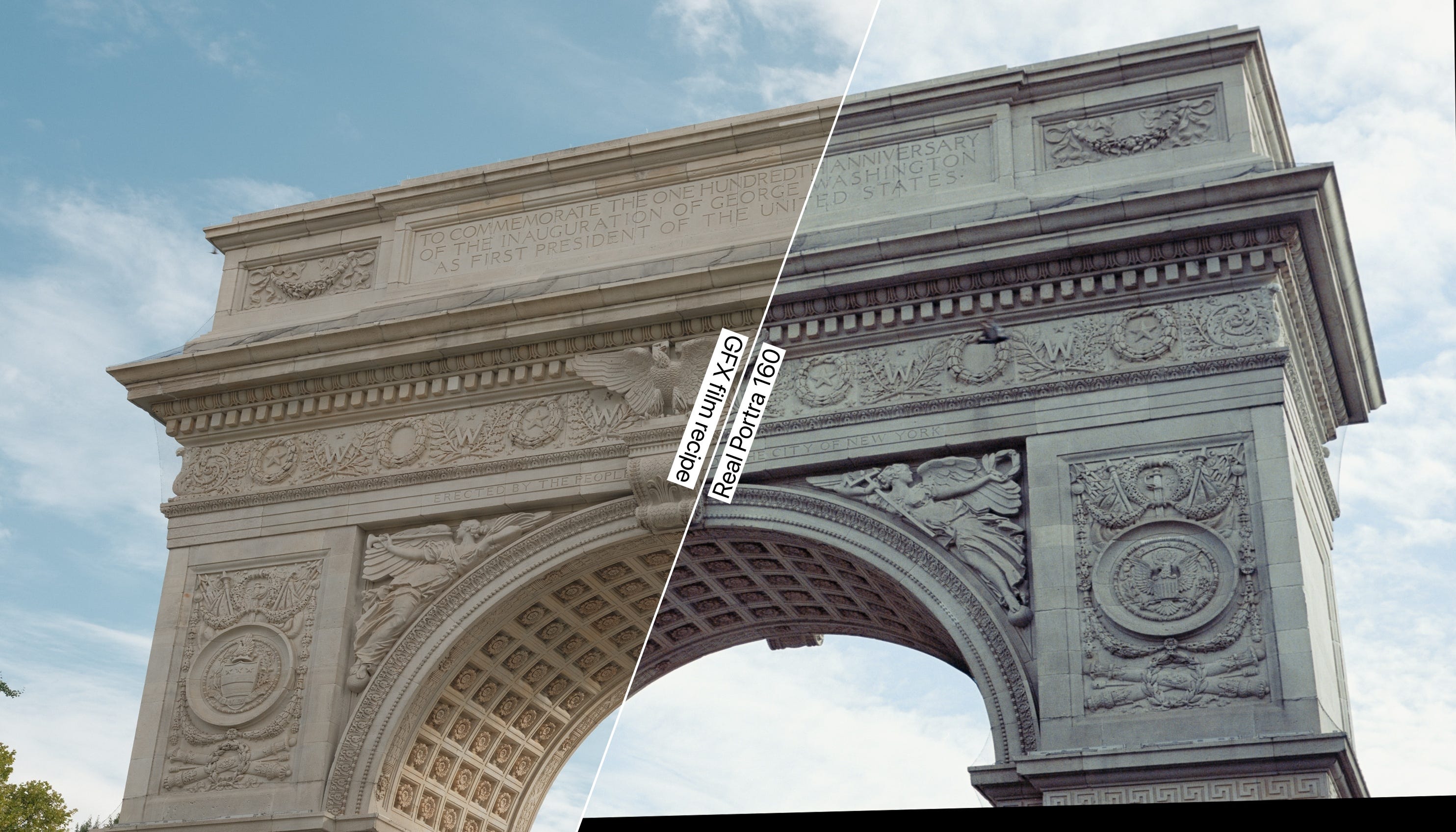
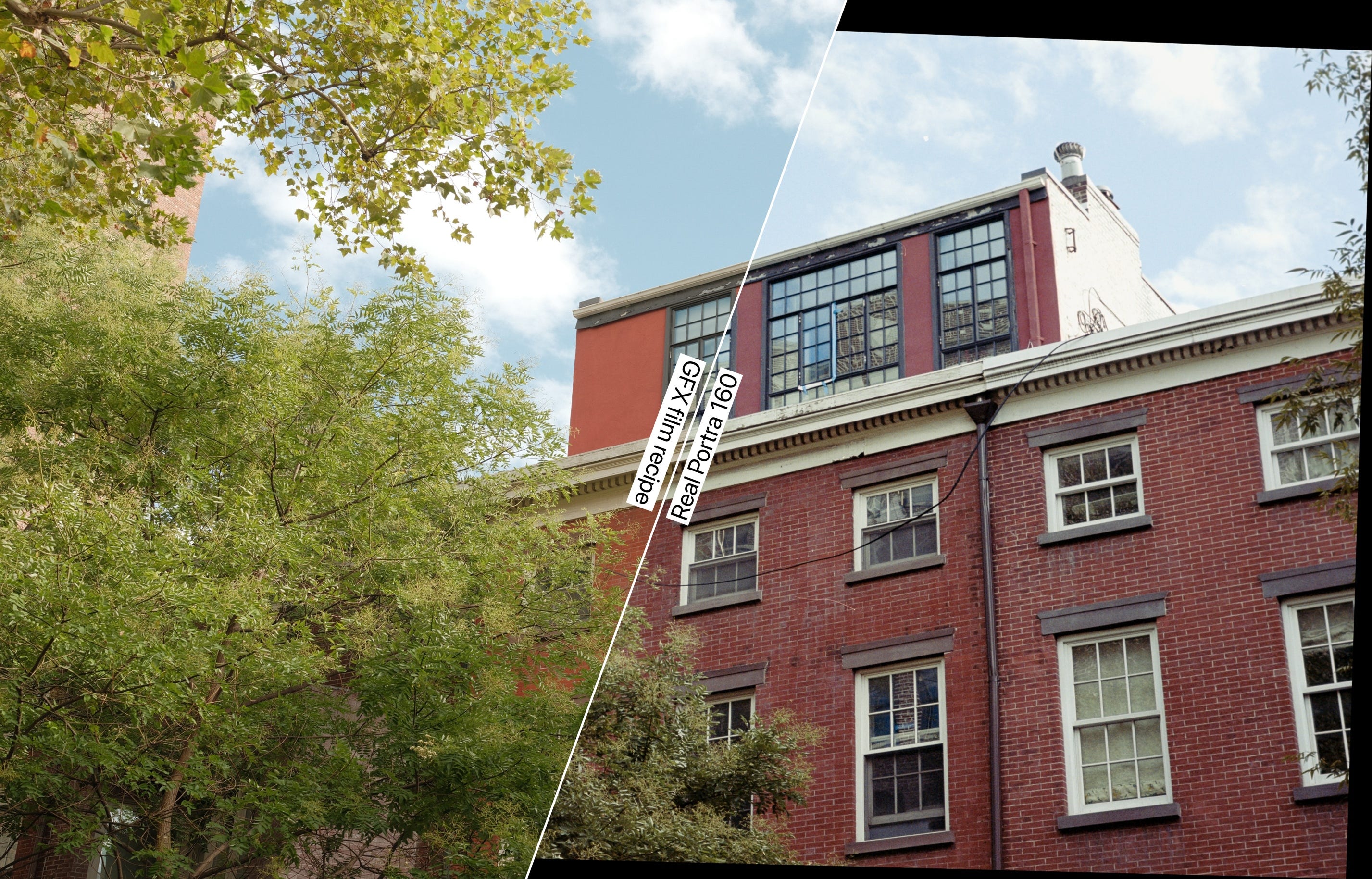
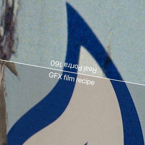
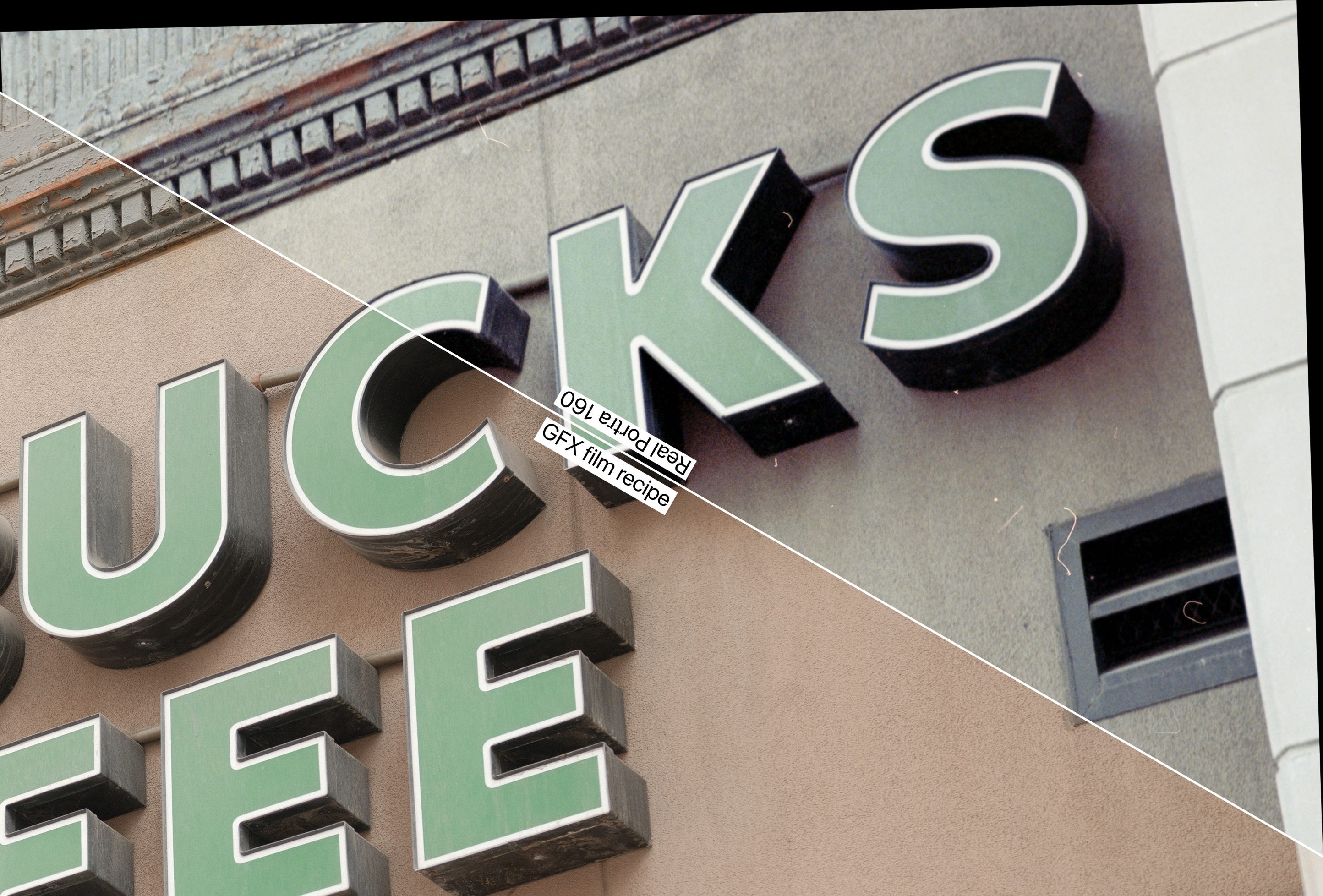
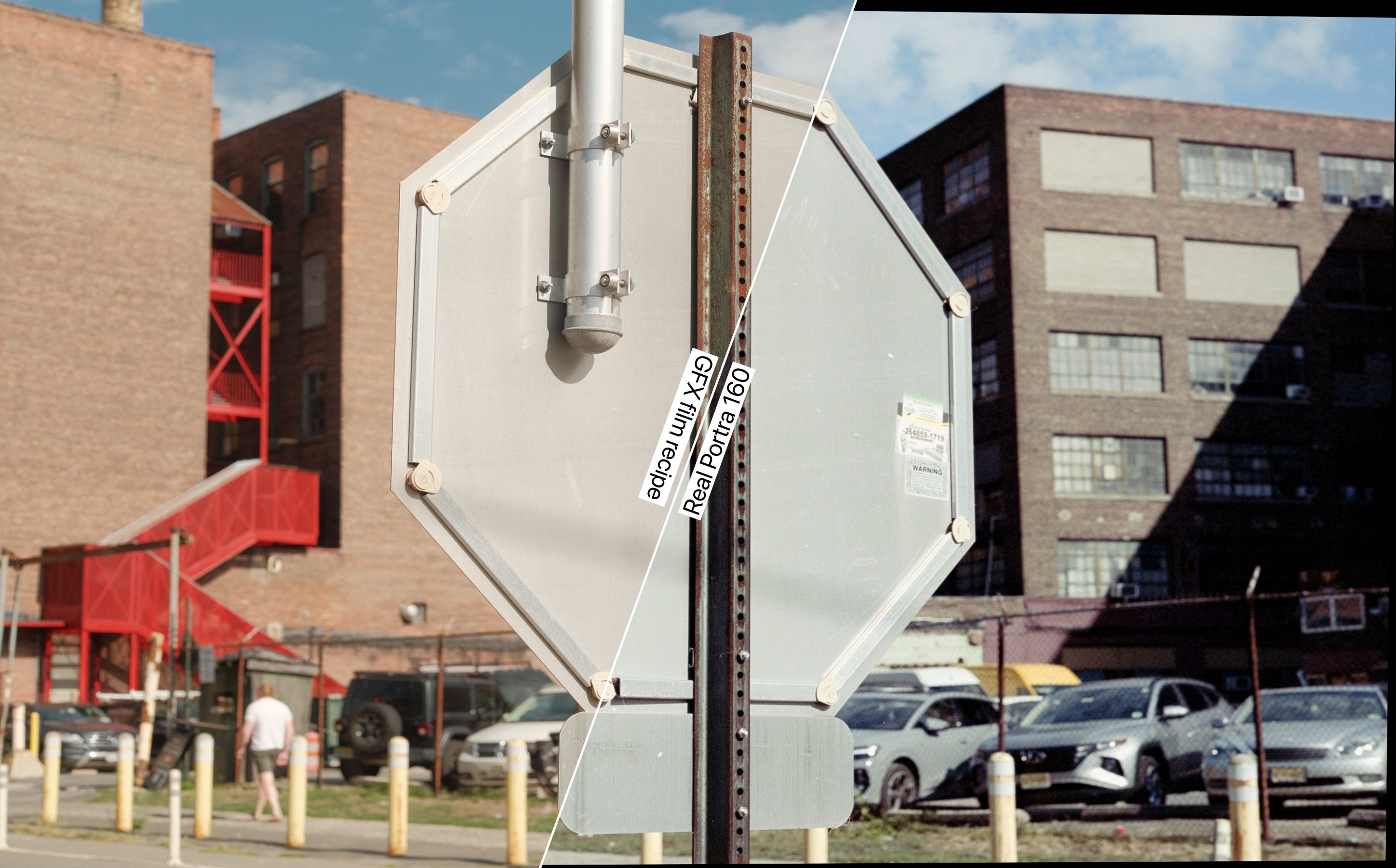
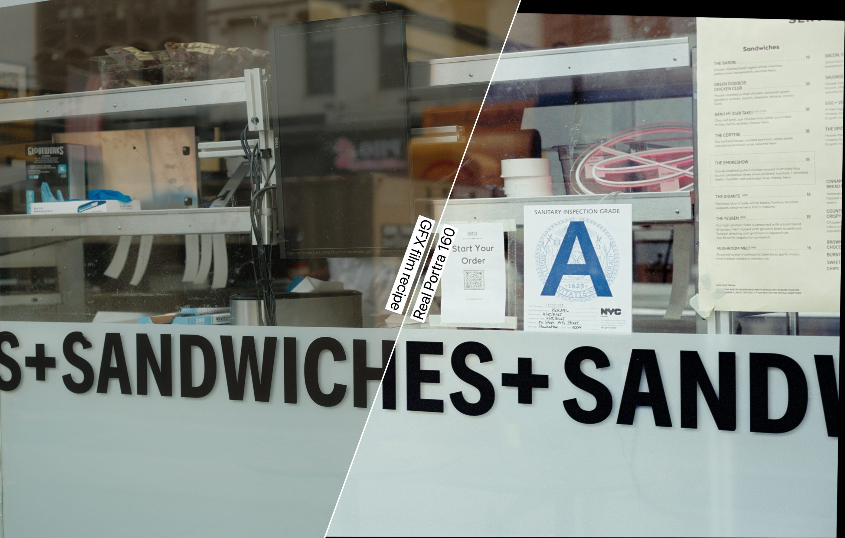
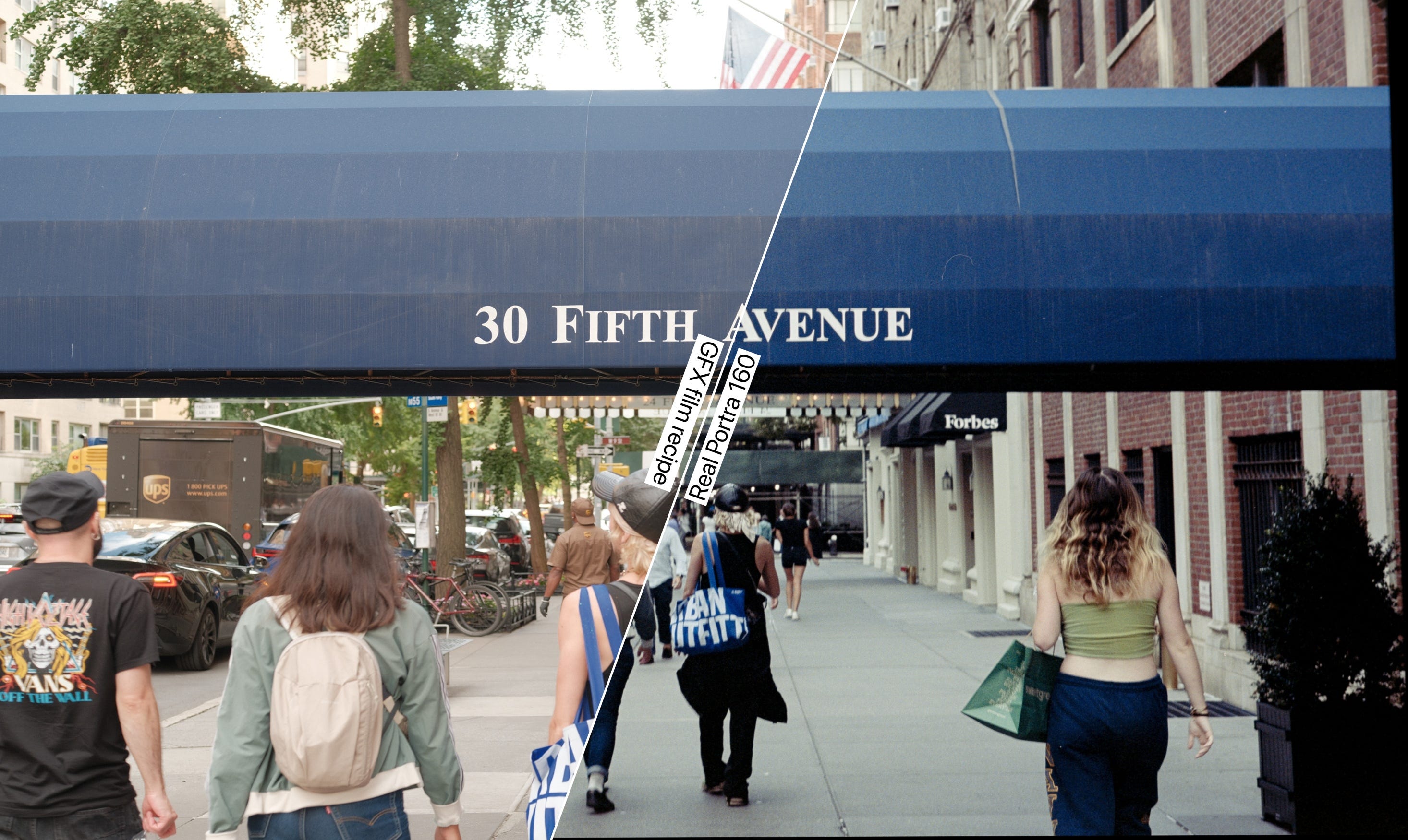
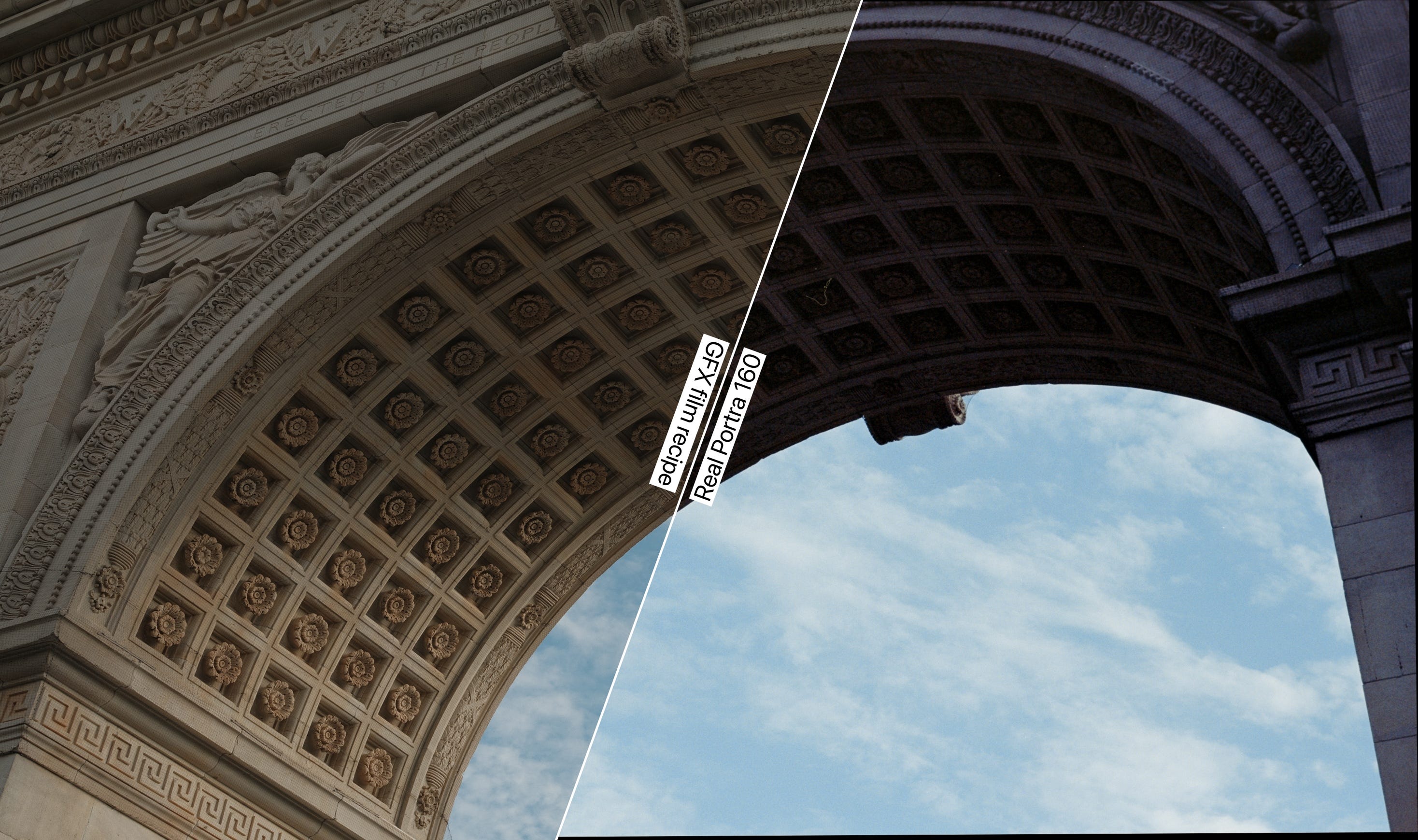
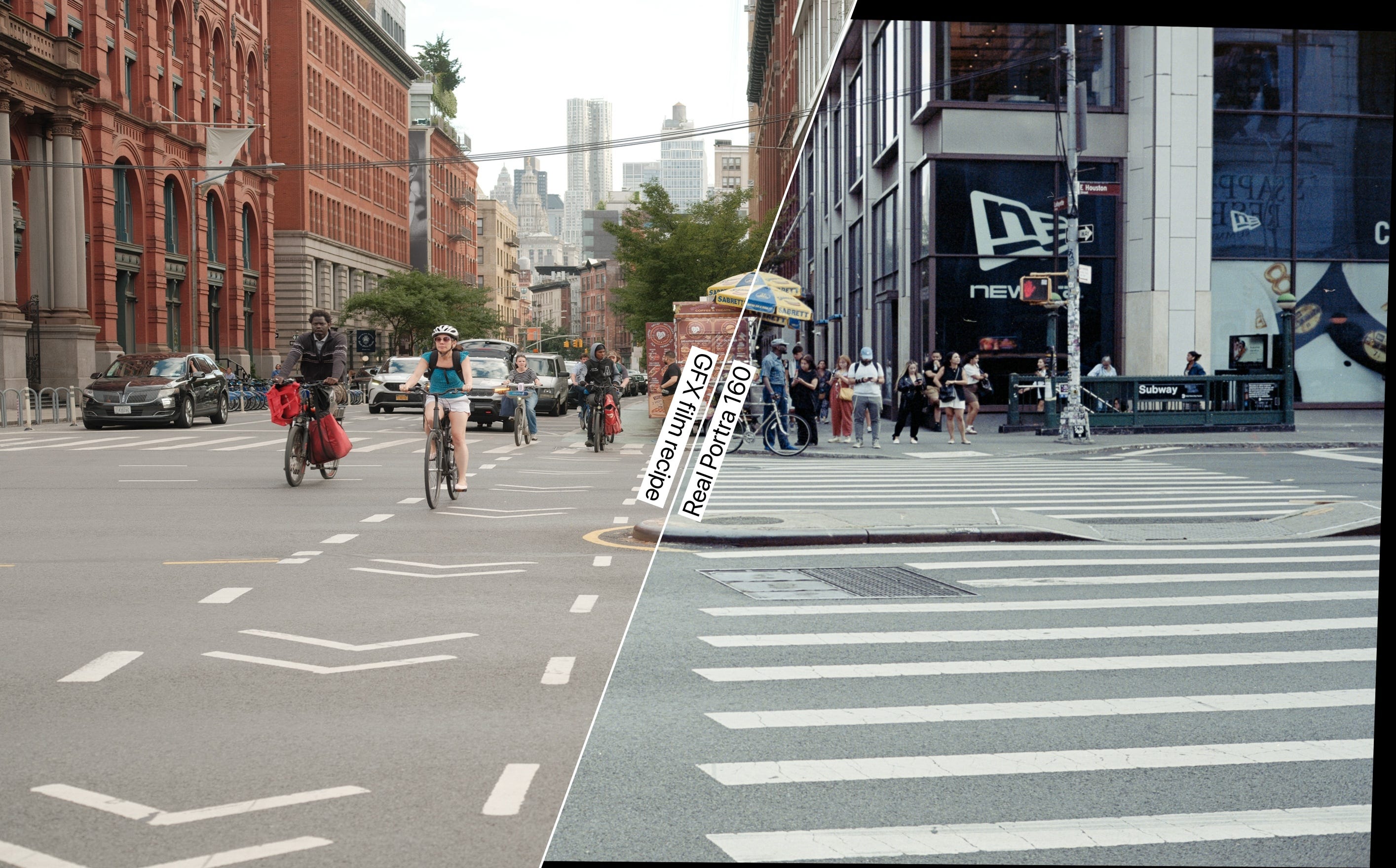
The second tool creates split-screen comparisons by slicing both images along an angled line and adding text labels to clearly identify which side shows the real film versus the digital recipe.
I think that approach is ideal for this test specifically because we are not comparing optics, but color signature and grain, so it's okay if one of the images look slightly more distorted than the other, it's a compromise made in the name of continuity having both images displayed side-by-side.
Shall we begin? If you like this topic, I think this is a good time to subscribe to this publication, because Portra is just the first film roll I'll compare. ❤️
Results
Dynamic range / exposure latitude
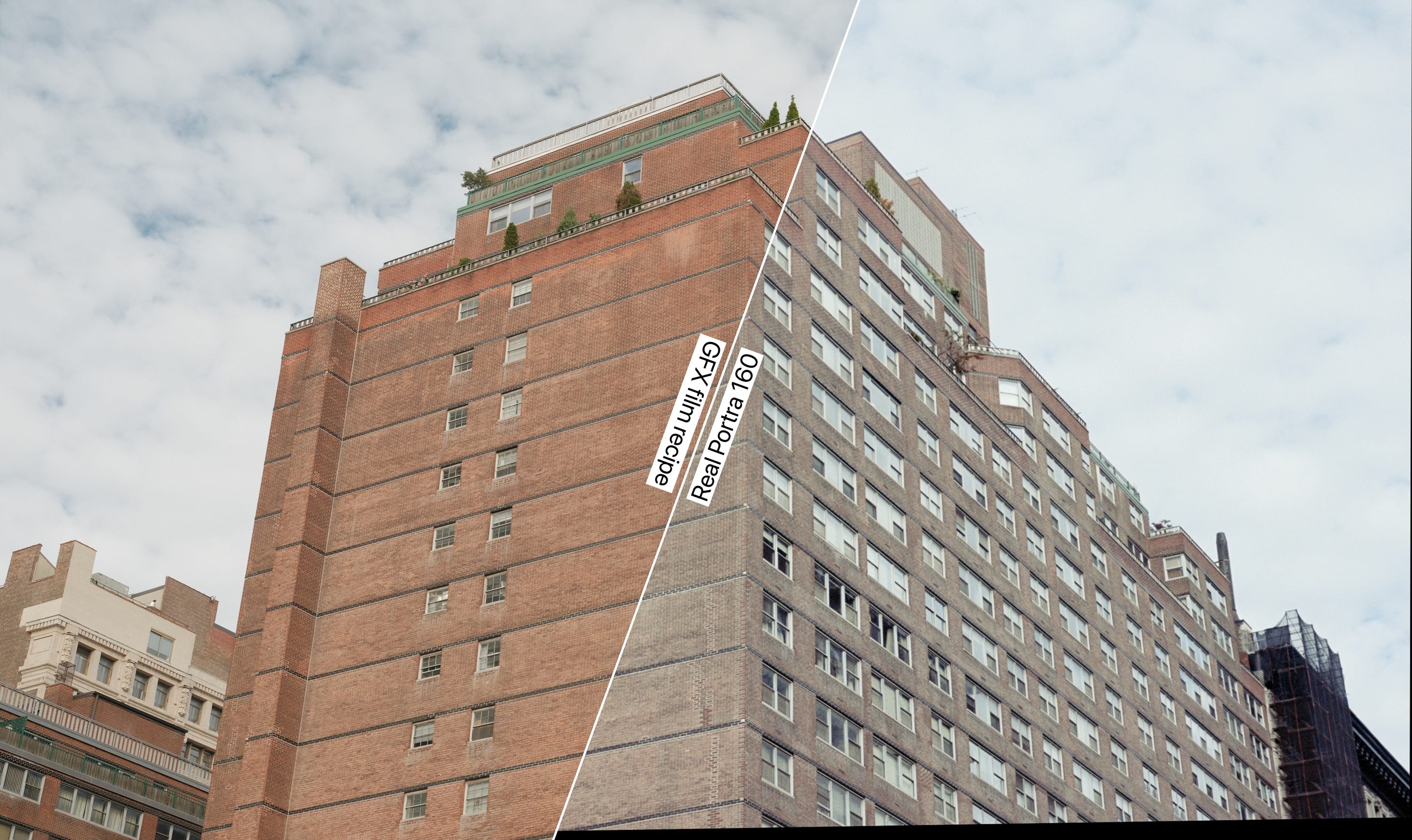
It is undeniable that color negative film has less dynamic range than modern sensors, especially when comparing with the one in the GFX (digital medium format). When put side-by-side, the film shots look to the sensor as positive slide film looks to color negative.
To my surprise, the film recipe of Portra 160 performed remarkably accurate! Well, Portra is an easy film to simulate (that's why I used as the first of this series). The dynamic range of the GFX is unbeatable (I think it has like 15 stops), and when a scene required DR, the GFX captured it all, and here's some food for thought: do we want/need extensive dynamic range?
I personally believe that the film version, even with its more limited dynamic range, presents more texture/contrast. The darker areas are more mystique, while the sky and bright areas are also well-represented. I think this is part of the "film mojo" phenomenon. The digital simulation is cleaner, sharper, more surgical though.
Color Saturation Behavior
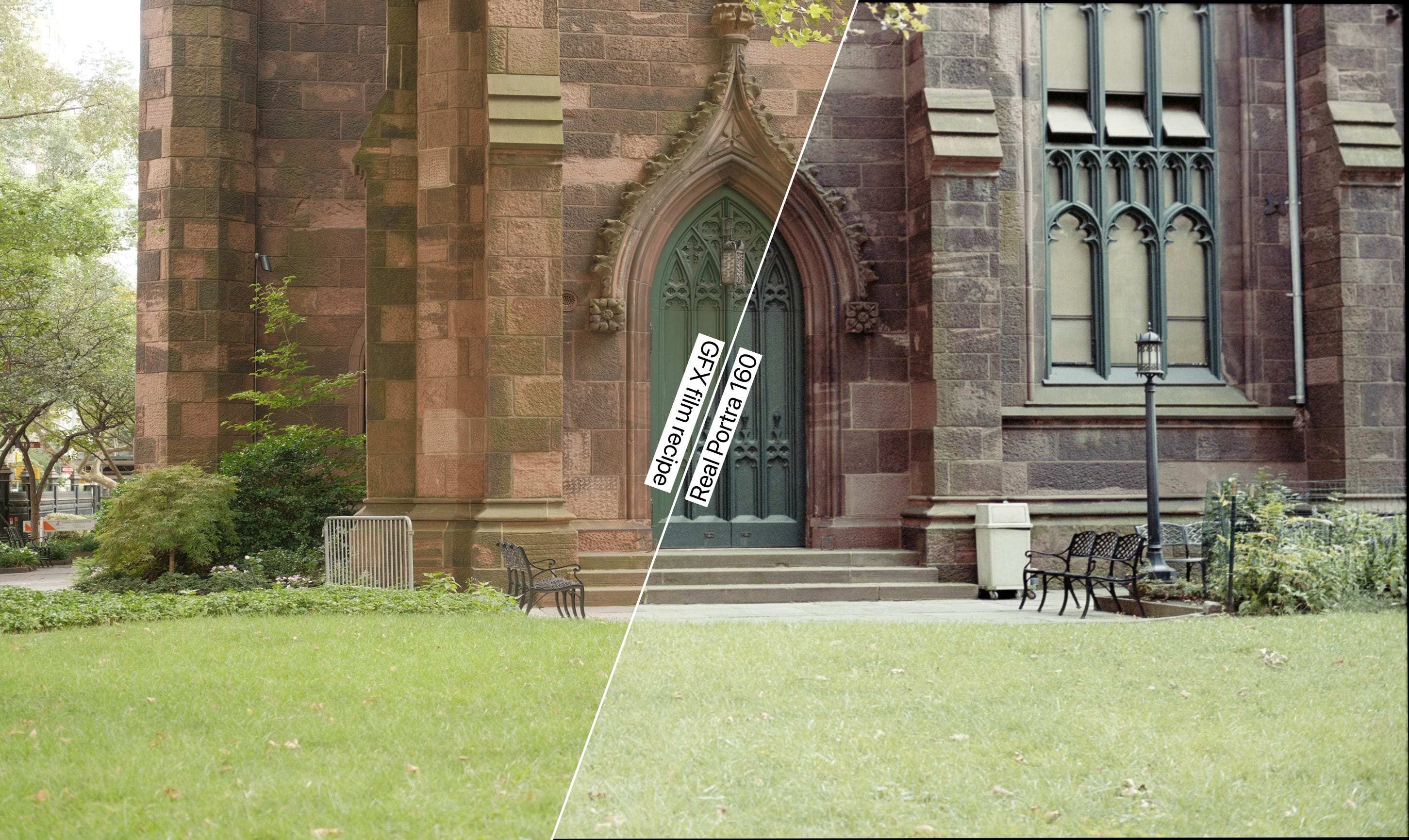
I also noticed that the shots from the film recipe always push the color grading to the warmer part of the spectrum, regardless of the scene. That's because the white balance is modified to Daylight, +4 Red & -5 Blue, which will always make everything look warmer. It looks more primary, less sophisticated, more… tinted. Perhaps reducing Red to +2 would be better.
To my surprise, the real Portra not always behaved in a pastel-toned way like I think it would. Sometimes, some greens even looked like a bleach bypass or fujichrome (see below). I'm aware that this may be due to my scanning process and the chemicals I used. Combining bleach and fix in the same chemical sometimes may result on that, according to my expert friend Kimi, who works at Gelatin Labs.
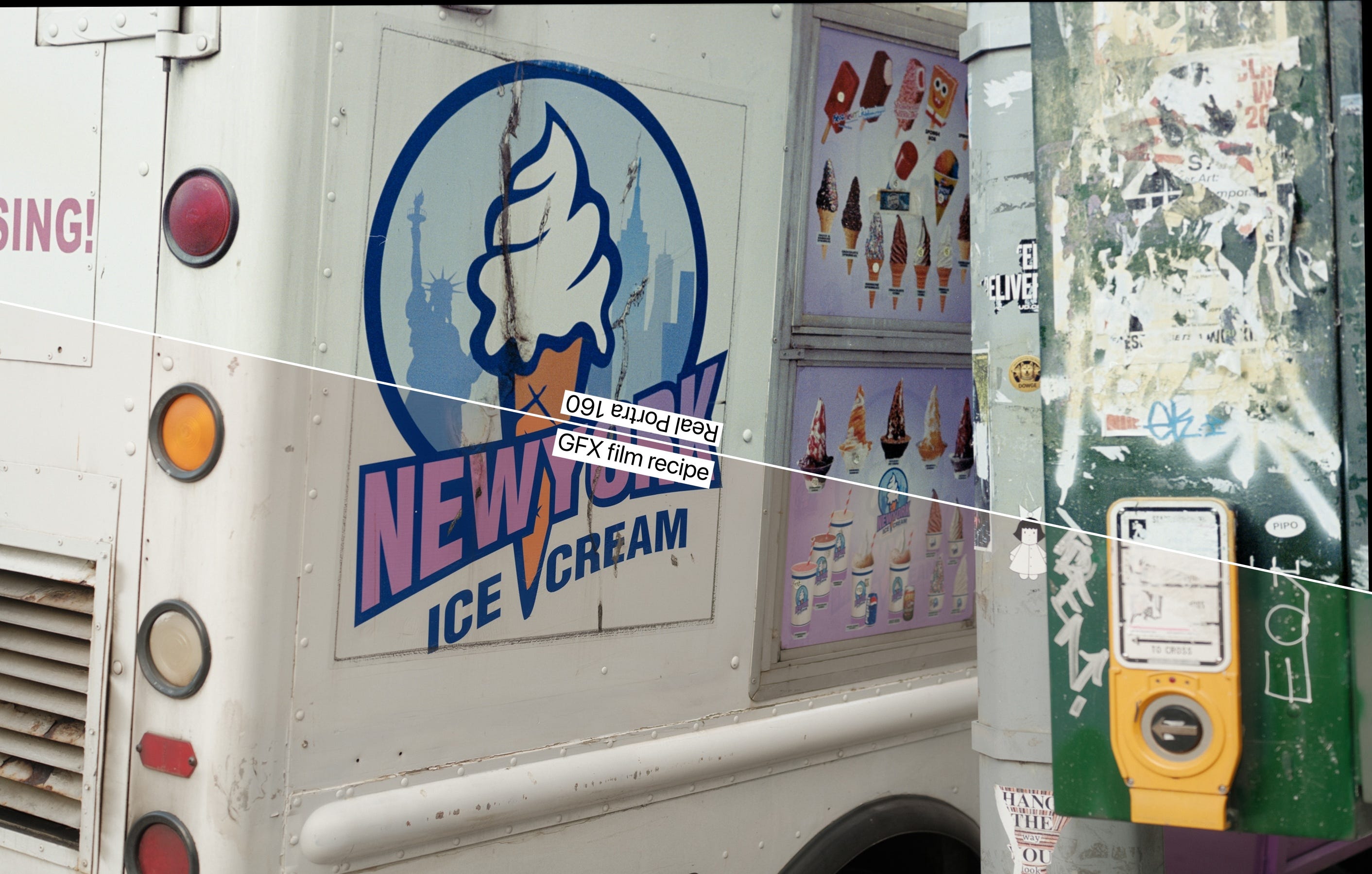
Echoing on the color-cast topic, on the real Portra I see a more contained and sucinct gray, not pushed to the yellow tones, like the asphalt color and the white floor here:
And the yellow vs. brown/rust color on this church:
Grain structure, texture, and dust
For natural rasons, here's where film truly differs from digital (and where some expensive plugins make their living). When viewing small resized images, sophisticated interpolation algorithms make the grain structures appear similar. This comparisons show both images at 100% zoom level.
At 1:1 magnification, the film grain exhibits a less sterile, more organic randomness that's inherently pleasing when zoomed out, forming out a texture similar to a painter's brush. In contrast, the digital noise comes from the ISO 320 setting, and displays the typical characteristic pattern of sensor noise.
Film also comes with dust, resulted from the real-world manipulation over an analog asset, which I personally think is a charm. Is it better? Some people like, some others think dust is their arch-nemesis. I leave that opinion for you, just click (or touch) on the red button and use your keyboard!
Also, speaking about charm, something not included in this test, which is something I love: film borders! I even wrote about it once in this publication.

More comparative shots
Conclusion (with some food for thought)
One thing is one thing, and another thing is another thing. Although this experiment clearly compares real film stock with digital film simulation, notice that I never stated which one is "better."
This was intentional, because "better" becomes complicated when discussing art and aesthetics. As I wrote in another post in this publication called "Film Photography During Modern Times," I don't believe people shoot film because it's objectively better or worse than digital — in any mature discussion, this comparison is simply beside the point.

A compelling advantage of film recipes is their convenience: as JPEGs straight from camera, they offer a quick, streamlined process to achieve a film look, especially when paired with compact cameras like the X-E3, X-Pro3 (rangefinder!), or X100VI.
However, this effectiveness depends heavily on the specific film look being emulated. I'm particularly curious to compare CineStill 800T and its distinctive halation effect with the actual film stock.
Portra (like most Kodak films) makes for a relatively straightforward recipe due to its pastel-tone characteristics and lack of complex visual elements that would challenge digital emulation. A more revealing test would involve comparing recipes with films that have stronger personality, like CineStill 800T (my favorite film stock).
Thank you!
Writing software to supplement my writings is time-consuming, also, I often reach out to software developers, like NLP, Filmonat, DxO, Adobe, etc. etc. saying that I run a film photography newsletter with X subscribers, and the higher this X, the more chances I have to receive software from them to evaluate, review, bring my opinion, and create articles like this for you to enjoy. In 5 steps, this should work like this:
You subscribe and I have better numbers
With better numbers, I have better reach
With better reach, I get more chances on getting software to evaluate
With getting more software, I write more stuff like this article
With more articles, you gain more good quality content